Kolraby
My Role
Product & Service Design
UX-UI & prototyping
User Research
Tools & Methods
Design Thinking
Problem framing
User & experts interviews
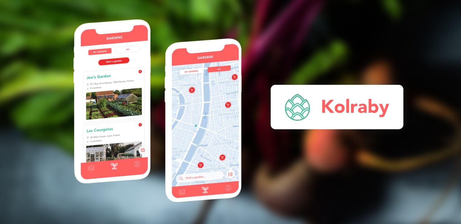
Kolraby is an app that promotes the development of shared gardens, to drive social and environmental change into the current polluting, unhealthy and alienating food systems.
Context
Conventional food systems are today extremely polluting and socially unequal industries and at the same time, so essential and profoundly linked to everyday practices. While food transportation and animal products represent important shares of the global greenhouse gas emissions, it is crucial to explore the full potential of local vegetal products. Because of historical events or of their peculiar visual aspect, some vegetables have been forgotten from the average consumer (kohlrabi, rutabaga, topinambour...) and although their nutritional properties are very interesting for humans, they slowly disappear from our plates.
Objectives
Through this project, I intended to transform the cultural image of forgotten vegetables and the practices around them to encourage eating more local and vegetal food instead of polluting - and often unhealthy - meat. One of my priorities was to make sure that women, who already carry an important responsibility in the ecological transition through the changes they do in the unpaid care work (buying, conserving, preparing food and manage waste...), were as much implicated as men in the change I would bring forward.
Brainstorming
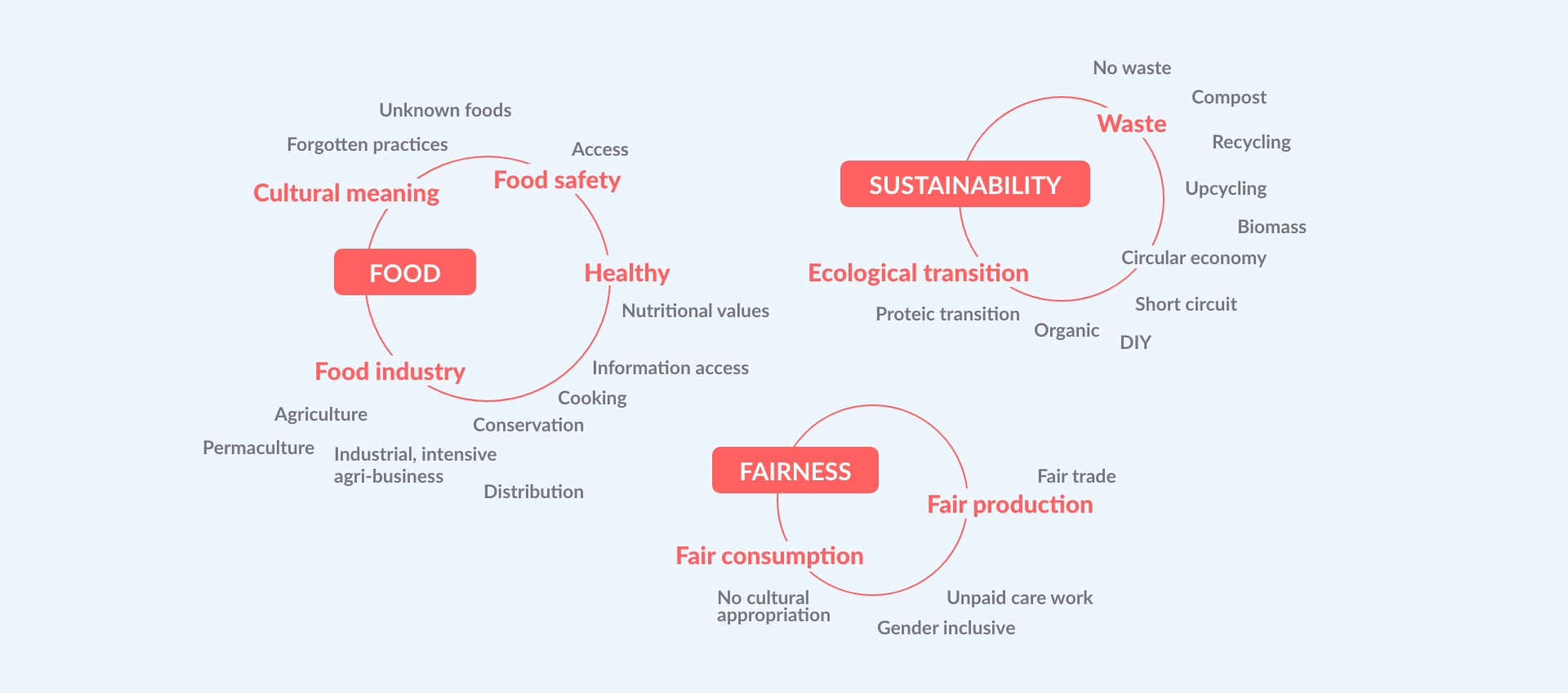
To begin with this complex issue, I tried to picture the many aspects of the current food systems and to identify the opportunities for change within them, keeping in mind my two goals: environmental and social sustainability and fairness.
Research
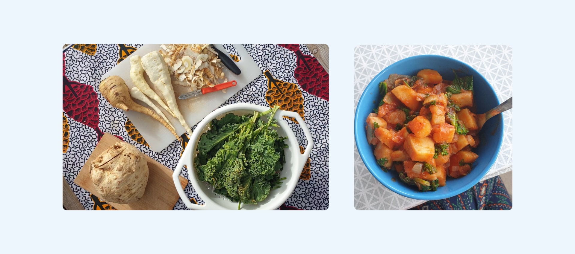
To first engage with the subject of the project - forgotten veggies - I had fun exploring the local organic food shop's shelves and learn to recognise the vegetables I did not know before. I then cooked them, making kale with soy dishes, topinambour crisps or inventing my own recipes.
Two main insights emerged from my secondary research:
Insight 1: Unsustainable food consumption is mainly due to a loss of proximity with food.
- Physical and time distancing: Food comes from far away through importation, and can be stored and cooled for long which distorts the concept of seasonal and fresh products.
- Economical distancing: In long food supply chains, the food's value is not understandable for the consumer, who has no overview over the various hands it went through.
- Social distancing: Food represents social belonging and people might choose their food on this criteria rather than on health or environmental impact criteria.
- Cognitive distancing: The way food is produced or grown is not always known, especially by younger generations.
Insight 2: Food resiliency is very challenging in large urban areas.
- Real estate pressure around towns and cities often forces food producers to increase their yields, which requires non organic methods.
- Urban food deserts emerge from a lack of affordable access to healthy food in certain neighbourhoods, causing malnutrition and dependency on industrial processed products. Initiatives like the Incredible Edibles network or the Ron Finley Project and its "Guerilla farming" address this issue by growing resilient food and communities.
- To be implemented and amplified on a long-term basis, access to such niche practices needs to be replicated and facilitated to a larger public.
Problematic: How to reconnect consumers to their food while reintroducing forgotten vegetables in their diets to allow healthier diets and more resilient food practices?
Interviews
When I first came to the Food Design teacher Aude Chaigneau-Messager with my questions about alternative urban farming, her expertise on sustainable food practice helped me to understand a tricky challenge: how to create a Design solution that systemises sustainable food practices without alienating the actors of these practices by imposing the solution on them rather than empowering them through this solution? Indeed, I believe that human interactions can lead to individual freedom through collaboration, and replacing social interactions with a digital service can easily deprive a community from their force and meaning.
I then interviewed Gaëtan who was growing vegetables on his balcony in Paris to understand his needs and challenges as a student in a big and expensive city. As a feedback on his resilient food production, he admitted that the yield was not economically viable because of the poor rain water and sunlight supply on the balcony and because he could not take care of the crops due to his regular absences.
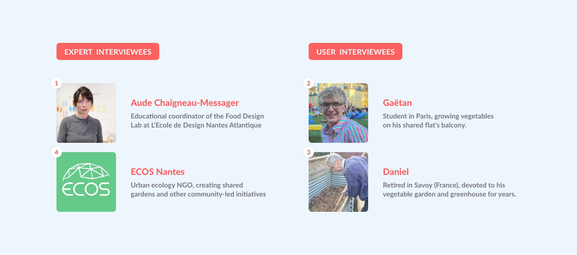
Understanding that a balcony might not be ideal for producing veggies in the city, I decided to learn more about the way a garden works and what it needs to be sustainable. I interviewed Daniel, who produces enough vegetables for himself and his wife. His garden's and greenhouse's visit, his technical advice and the readings he recommended helped me to better understand the whole practice of being self-sufficient in vegetables.
After this, it seemed obvious to me that the best way to grow vegetables is still in a garden. So I visited the ECOS NGO based in Nantes (France) at one of their shared gardens and greenhouses to ask about the service they provide to the members. Their main challenge laid in the lack of accessible gardens.
Define
Target Users
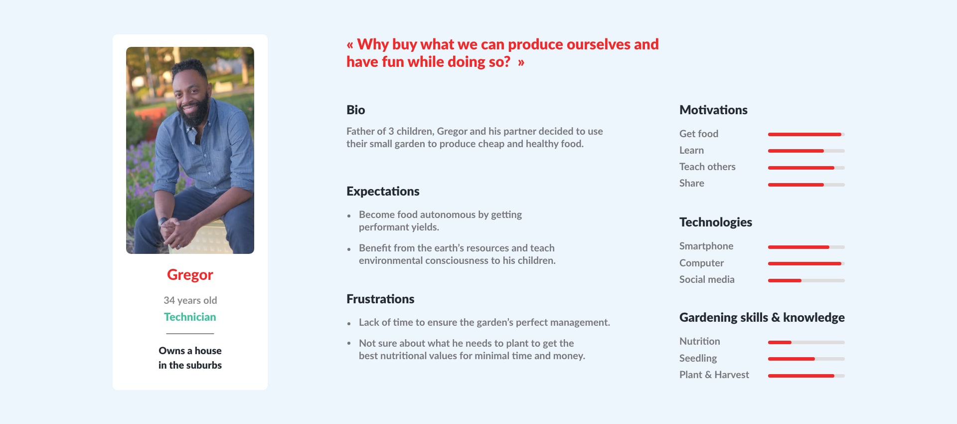
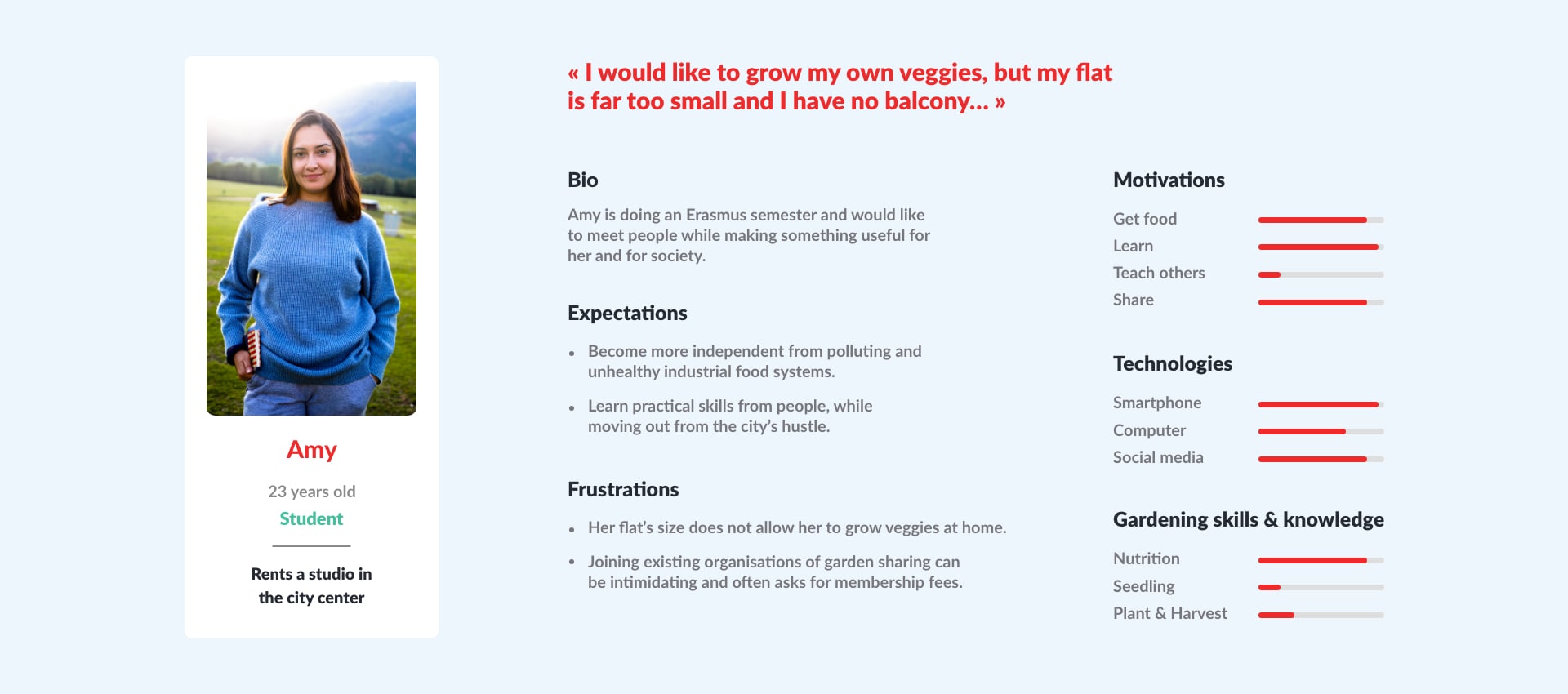
Thanks to the insights I collected during the interviews and the secondary research, I was able to describe two personae, Gregor and Amy, who would need and want to grow vegetables in a resilient way in urban areas.
Main features
These personae's expectations, frustrations, skills and motivations, helped me determining the nature of the Design intervention: a smartphone app and website connecting people owning a garden in urban areas with people without a garden, both wanting to grow their own vegetables with minimal costs, time and skills. This would be possible by putting individual resources together and through sharing them with co-gardeners:
- Sharing a garden.
- Sharing of the costs of gardening tools and resources.
- Sharing the people's time and tasks.
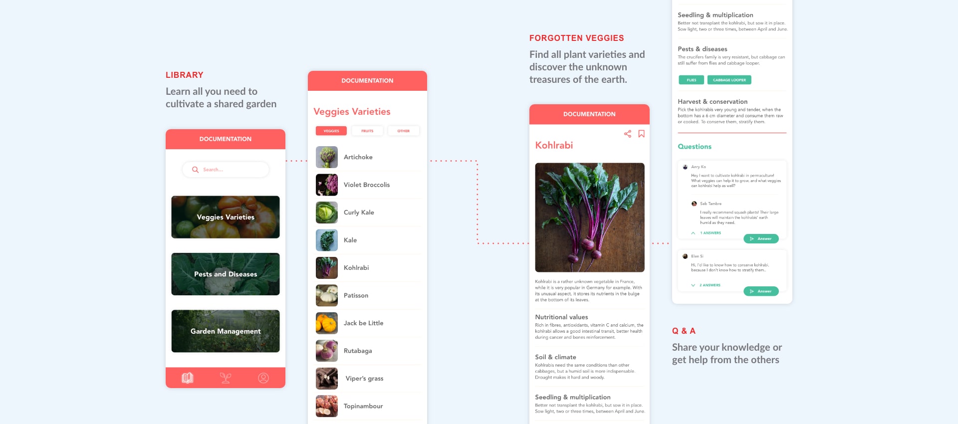
- Sharing of gardening knowledge and skills.
- Sharing the crops!
User Journey
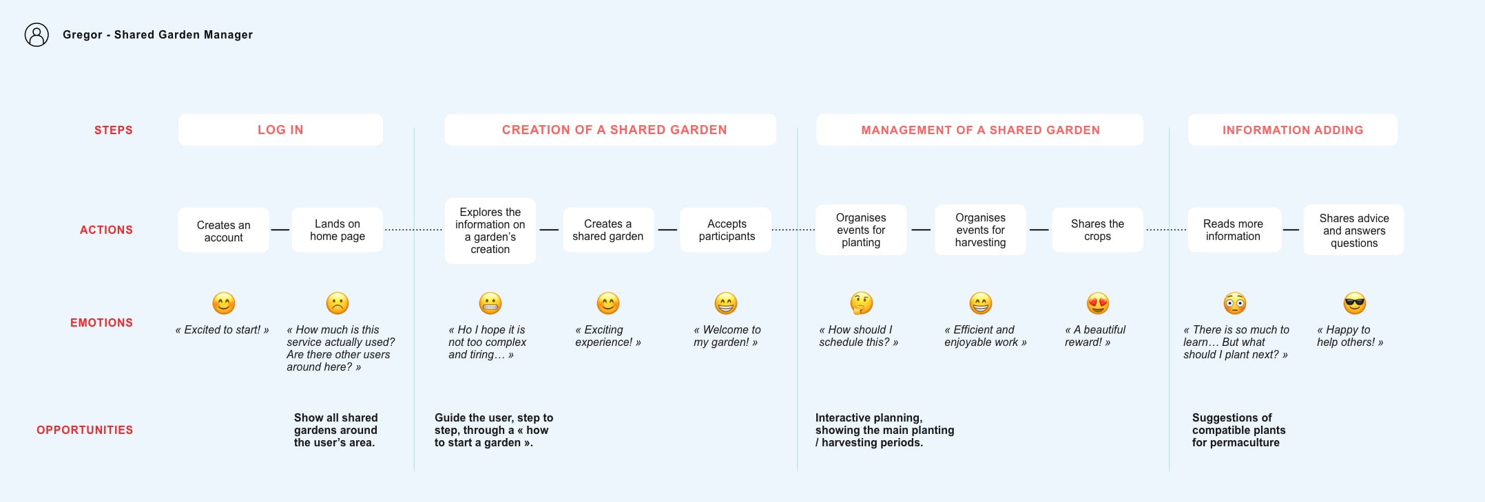
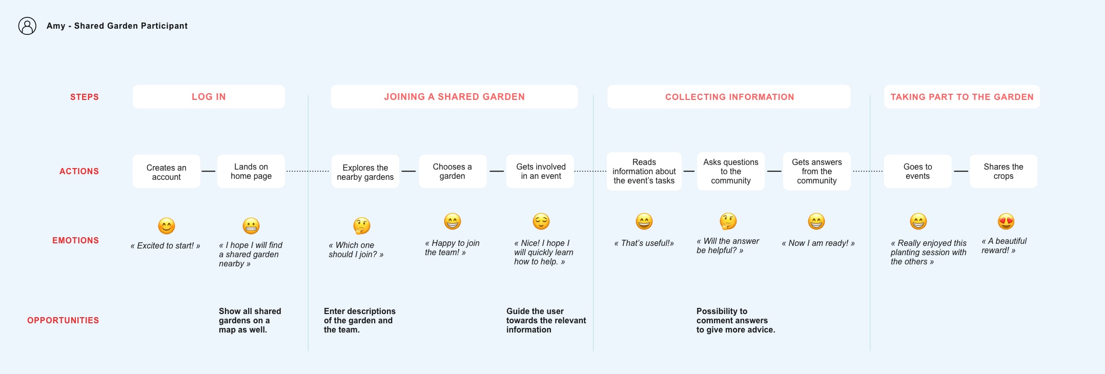
Following each persona's profile and their use of the service, I examined how they would experience it, to avoid pain points, spot opportunities and finally provide meaningful and enjoyable interactions with the service and the other users.
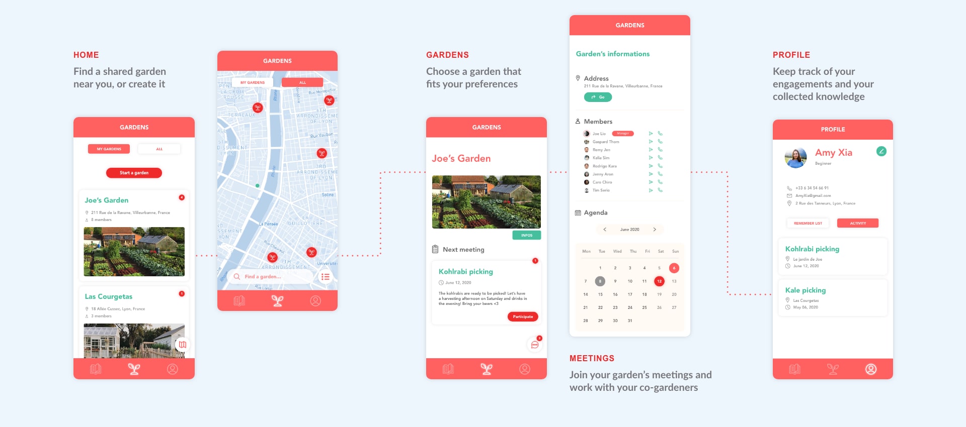
Gregor owns a garden in the suburb but lacks time to manage it and efficiently grow vegetables. He will mainly add a new garden on the app, accept co-gardeners' demands to join the garden project and organise the gardening sessions. He might as well share advice with other users on the app if he feels like he can help them.
Amy does not own a garden but would like to meet new people and adopt more resilient food habits. She will first choose a garden that fits her preferences, register for its next gardening session, explore the information available on the app and ask questions if needed to the community. She will then enjoy learning with her co-gardeners to plant and harvest. For both personae, crops are shared depending the participants' work input.
Information architecture
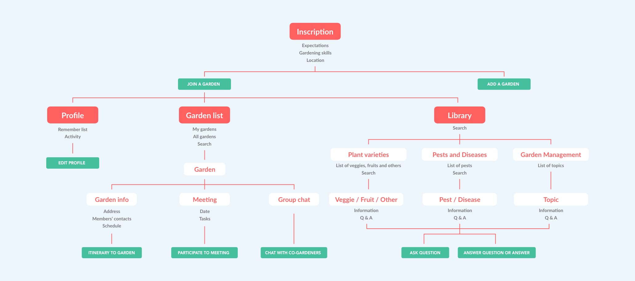
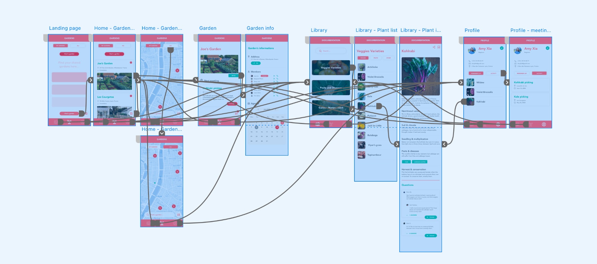
In parallel to the user journeys, I built the app's information architecture which allowed me to determine the most adequate structure for the app, in regard to the users' navigation patterns.
Prototype
Wireframe
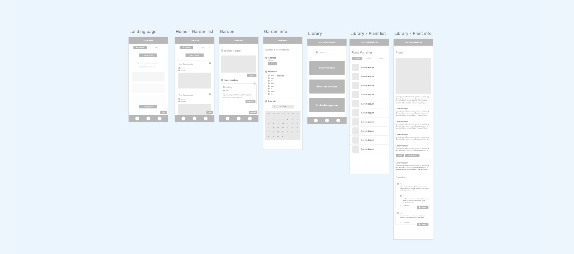
I then wireframed the main pages of the app to test the information architecture, iterating it many times.
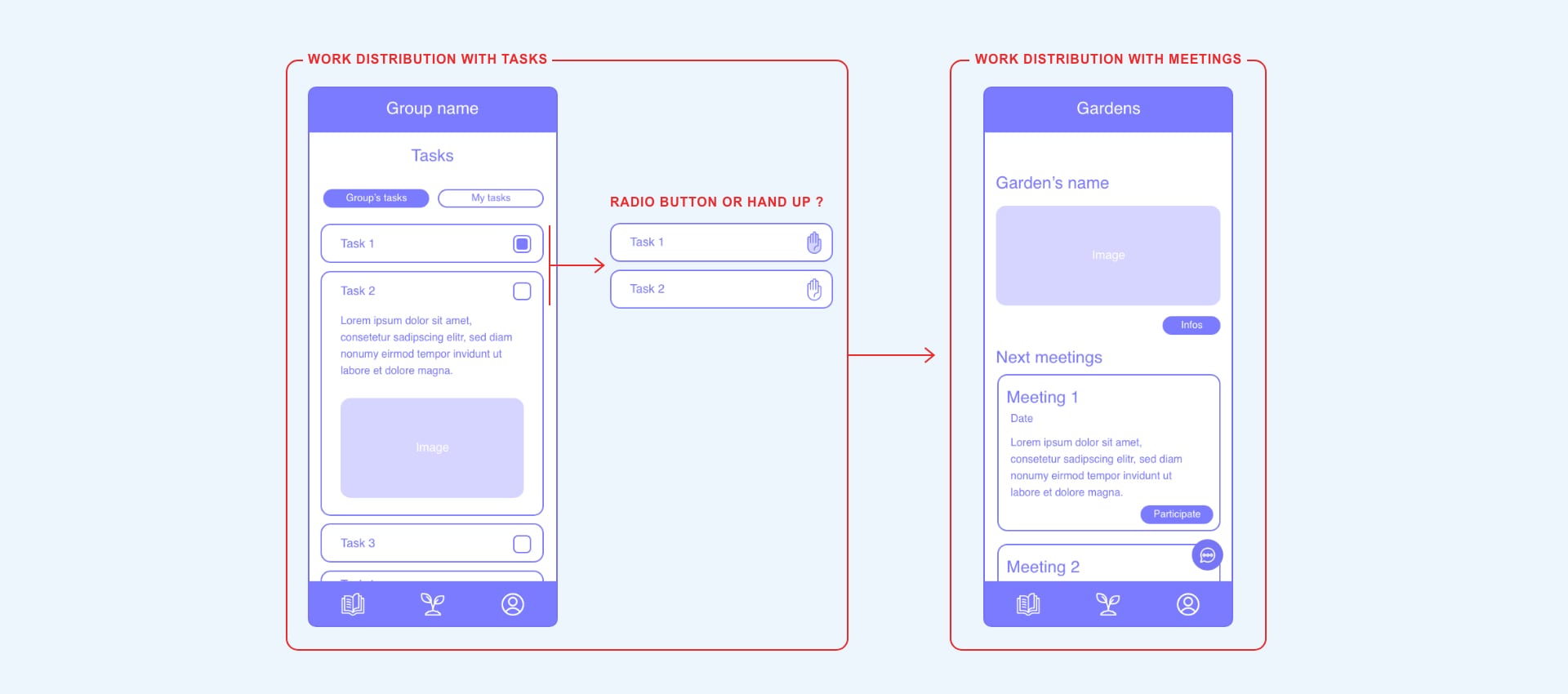
The main struggle I encountered was the way that co-gardeners work together in the garden, to allow the tasks to be equitably shared. I first tried to use a task sharing functionality: the garden manager would decompose the work that needs to be done in smaller tasks, which every participant could be able to choose, depending on each one's skills and ambitions. This appeared like a rigid and impersonal to-do list, and encouraged asynchronous participation, which limits social interactions... I rather chose to install a meeting system: the garden manager would suggest a meeting date, to be sure most people can join, and determine the main tasks to be done during this meeting. Participants would join and spend some time gardening together, in their own way and with their own rhythm. This gives more freedom to everyone and allows social interactions to act as a resiliency vector rather than technology.
Visual Identity
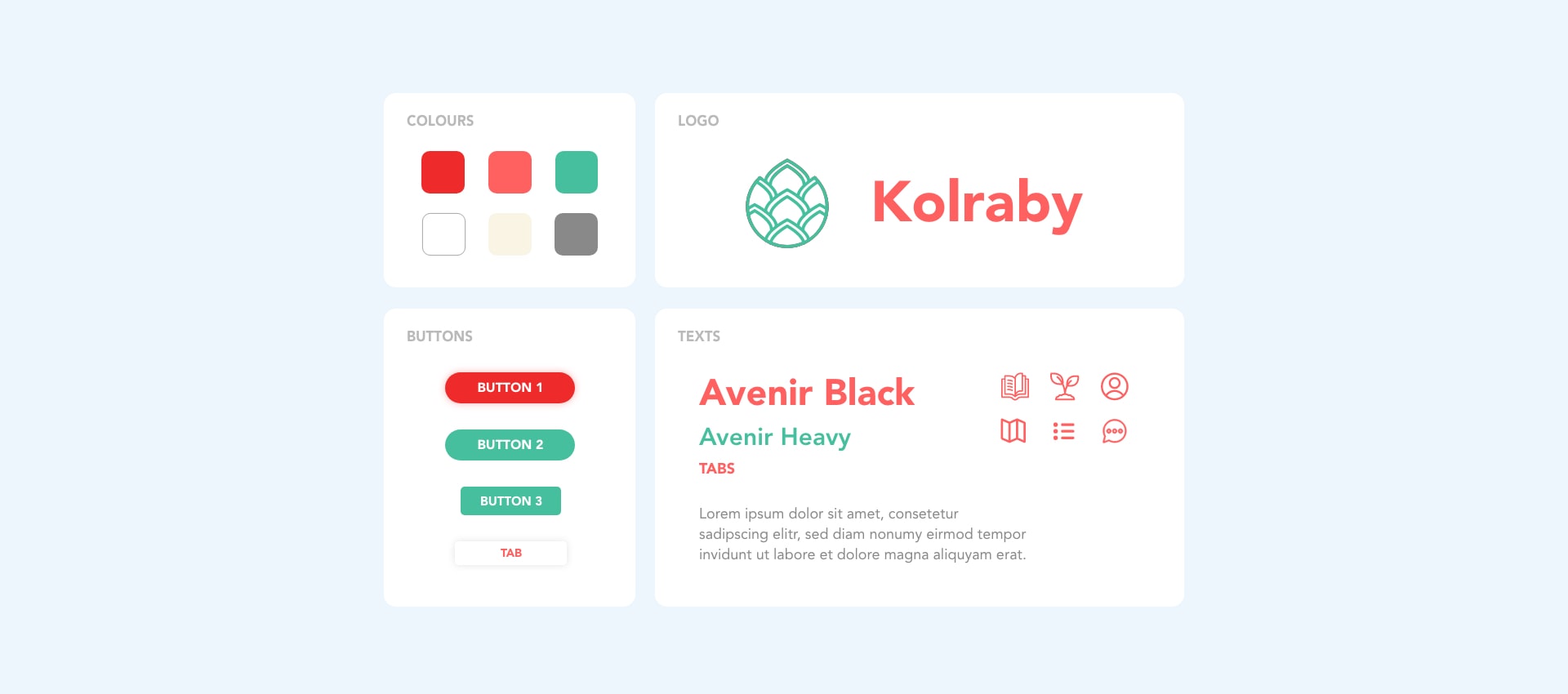
The kohlrabi, a beautiful forgotten vegetable, inspired the app's name and logo, as a symbol of growing back the treasures of the earth together. Composed of smooth shapes but bold colours, the visual identity of the app conveys a feeling of positive action. Perfectly balancing this specific shade of green, the salmon colour reminds of the warmth of working in the garden with others on a late summer afternoon. The straightforward symbols enable an intuitive experience while adding poetry to the service.
Final Prototype
Applying the visual properties to the wireframes and iterating it at the same time, I finally created an interactive prototype of the service. It is divided into three main tabs that are present in the navigation bar: the shared gardens, the library and the profile page. Here are the main screens of the app:
Conclusion
Running this project alone and without special gardening skills and knowledge, I realised how much interviews and personal immersion were precious for a designer. Going on the field and meet people that could teach me gardening provided me precious insights that I could use to make more meaningful choices. In the future, I would like to deeper explore the challenges of sharing ancient knowledge that is about to disappear, like the practice of growing forgotten vegetables. I also hope to be able to spend more time on the prototyping phase of my future projects and lead user-tests that would challenge my work and perfect the final product.
 Next Project : Lyon Festival of Lights